800-454-9103

Is Your Website Design Driving Customers Away?
A recent study found that it takes only 0.05 seconds for a customer to form an opinion on your website. In those seconds, customers determine if your website is worth staying on or leaving behind.
If your website isn’t engaging, personable, or highly functional, people can lose interest. Plus, if it suffers from bad design, you can push customers toward your competitors. After all, there are millions of websites to visit.
That’s why we’ve investigated the top website design flaws, so you don’t have to. From hard-to-read fonts to poor color choices, you can learn what not to do. Now, are you ready to get started? Here’s an in-depth look at bad website design:
It’s Slow to Load
One of the worst mistakes you can make is not optimizing your website to have a speedy loading time. Visitors expect a webpage to load within less than two seconds. If your website fails to do so, your customers will be frustrated.
After all, visitors want to find information fast and easily. When a website loads too slow, customers will leave to find another site.
So it’s imperative that your site meets your customers’ expectations. One of the main reasons a website loads slowly is due to large files like images, videos, or gifs. To fix your slow loading time, cut or condense your large files to make them load faster.
Also, make sure that your webpage has an up-to-date content manager! If you’re using an outdated CM, it may have bugs or errors that affect the website’s speed. You can even test your loading speed with tools like Google PageSpeed. That way, you know what customers are experiencing and understand how they’ll feel.
Difficult to Navigate
Most businesses struggle with the layout of their website. In fact, one of the common mistakes companies make is having a disorganized website.
Customers don’t want to search for their information after finding your website — they want to locate the information quickly and easily. You could risk driving clientele away from your site if it’s too difficult to navigate! Instead, include a navigation menu either at the top of the page or to the right. That way, visitors can click through the options to select what they’re looking for.
Plus, make sure that your visitors can get back to your homepage if they need to. Whether it be through your navigation menu or by clicking on your brand’s logo, include a way for customers to browse back and forth.
Also, check to ensure that all the links work and correspond to the right page. You don’t want to accidentally lead visitors to a non-working page or the wrong item link.
To ensure your website is organized, do a walk-through of it yourself. Act like you’re a customer and see how easy or hard it is to use. That way, you know what you need to modify or what works.
Hard to Read Fonts
No one wants to enter a website only to find out that the text is difficult to read.
Generally, there are four mistakes you can make when it comes to fonts, they include:
- Text that is too small or too large
- Decorative text
- Too many different fonts
- Clashing colors
Readability is what you want to aim for. So make your text as clear and precise as possible. You don’t need to get creative with your fonts; simplicity is key.
Use classic fonts like Times New Roman, Cambria, or even Didot. These fonts are certainly readable and will impress any viewer.
As for color selection, black font is all you need for your content and about page. After all, it’s traditional and makes your text bold and clear.
Now, you can extend the black font to your entire webpage; however, if you want to showcase your design skills, you can use white font for your title page, headings, or menu items.
To ensure your website looks easy to read, you can always preview your website. In fact, you can look at it from different screens to see how each page translates to another medium. That way, you know what customers see when your site loads.
Too Cluttered With Animations
A good website has animations that captivate your audience and grab your customer’s attention. However, it would be best if you utilized these in tasteful amounts. If you have too many animations, it can overwhelm the viewer and confuse them, leading them to exit the site.
To fix this problem, you’ll want to eliminate some of the unneeded parts of your design. Ensure you get rid of anything extra that makes your website look cluttered or busy. That could mean clunky page transitions, walls of texts, videos, or photo animations.
Although the best course of action is to utilize the white space on your website. After all, white space will help customers read your content and find what they need.
Use the white space to help your site look clean, sharp, and innovative. This area will even prevent you from adding too much clutter. In turn, it will make your site a popular destination.
Get Rid of That Bad Website Design Today
Designing a website is always tricky; however, they’re a few mistakes you certainly want to avoid. Common mistakes consist of slow loading times, a difficult to navigate site, or choosing a hard-to-read font. Not to mention, you have to remember to eliminate the unneeded animations and use the white space for your website.
After all, your website displays your brand and who you are as a company. So you don’t want your customers to see a bad website design, but rather your website as an innovative marketing page. That’s why we at Ferocious Media are dedicated to helping all businesses achieve online success with digital advertising and marketing.
For more information about website design, contact us today for a free consultation. We look forward to helping you!
Recent News

Is Google’s AI Overview Stealing Your Leads? The New SEO Rules for Home Service Contractors
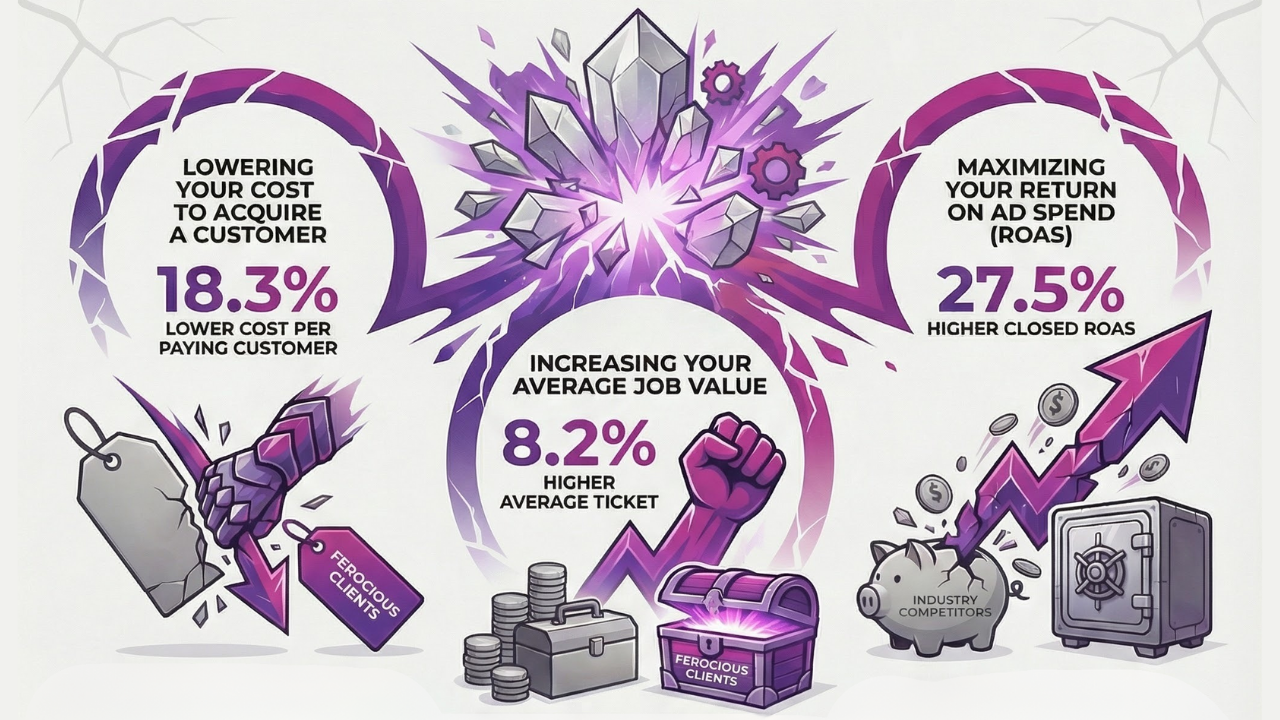
Unleashing Ferocious Results: Our Q4 2025 Advertising Performance

Twenty Years of Ferocious Media: A Founder Q&A on Staying Relevant, Efficient, and Accountable
Does Blogging Still Matter for SEO in the Age of AI?

GBP Radius Tightening: Why “Near Me” is Volatile Going Into 2026
The Real Way to Measure Home Services SEO Success (Beyond Rankings)

Seasonal Strategy: Winter HVAC + Holiday Slowdowns
Ready for success?
Take the first step toward accelerating your business growth today!


