800-454-9103
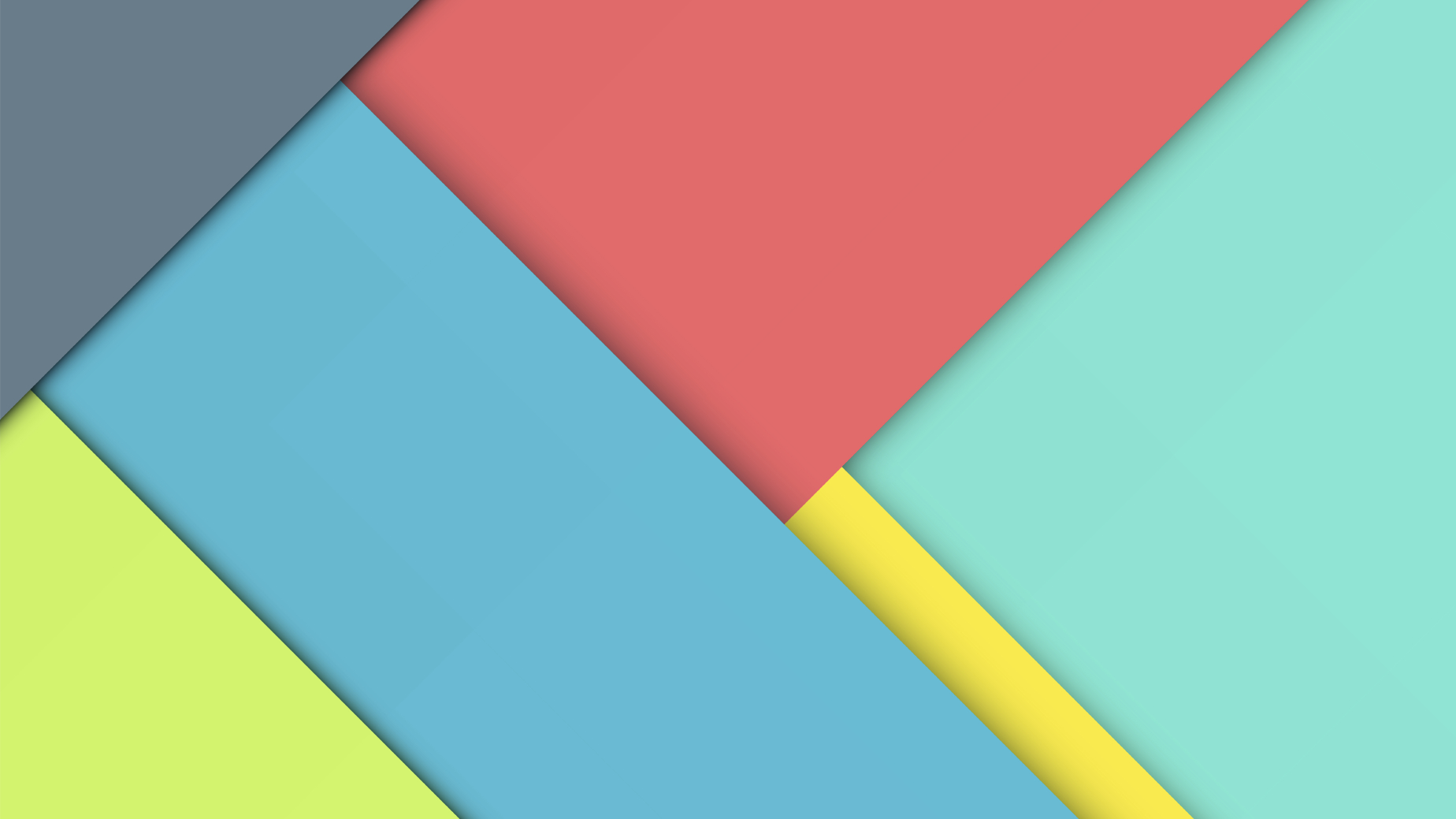
Get To Know Material Design
What is Material Design?
Even if you haven’t heard the term Material Design before ─ you’ve probably seen it.
Since being released in 2014, Google’s Material Design principles have been gaining popularity in the app design industry. Although it is essentially a set of design standards for apps, many of the ideas can be applied to any UI ─ including responsive websites, which are meant to be user-friendly on all devices.
Android’s operating system Lollipop first released Material Design out into the digital world. Google has also been upgrading its suite of apps to reflect the new design, including GMail, Hangouts, Google+, and more. Earlier this month, Google even transitioned its logo to the Material Design look.
But with Material Design, it’s more than just a visual appeal. Per Google’s Material Design Guidelines, the goal is to “Create a visual language that synthesizes classic principles of good design with the innovation and possibility of technology and science.” The guidelines provide extensive details on color palettes, layering elements, animation, icons, typography, and so much more. One of the key takeaways from these guidelines is usability through meaningful transitions ─ design elements with a purpose, not just for the sake of designing them.
The benefits.
From a visual standpoint, Google’s Material Design is very similar to the trending “flat” design that has emerged across the web over the past 3 or 4 years. Flat design uses clean, simple and minimalistic elements. It removes all visual elements such as drop shadows, gradients, etc. and some would argue that if used too heavily, it might make a website’s usability confusing.
Material Design improves on these usability issues by strategically layering elements, using drop shadows where necessary (for example, a clickable button), and encouraging straightforward navigation and site interactions. Use of Material Design also helps to promote a consistent appearance across an entire website, which is important for branding.
Should I use this on my website?
It’s not necessary to strictly adhere to all of the principles for Material Design when creating a new website for your business, but it is a good idea to keep them in mind. Here are a few that are helpful when designing an effective website for your brand:
- Be strategic with your color palette. Use a consistent color palette across the entire site. Choose a primary color and an accent color, and be sure not to overuse the accent color. Always be sure to use a dark enough text on a light background, as well as a light enough text on a dark background, to ensure readability.
- Purposeful navigation. Make sure your users are able to easily navigate to your most important pages and content. Put less essential content in a dropdown or secondary navigation location.
- Add consistent icons. Google released a set of Material Icons using an icon font. These icons are bold, geometric, and are easy to recognize even at the smallest screen sizes. Since they are a font and not images, your site’s load time will remain fast when using these!
Interested in updating your website design to better fit your brand and business, but not sure how? Ferocious Media’s responsive web design team can help! Get in touch with one of our Digital Media Consultants today.
Recent News
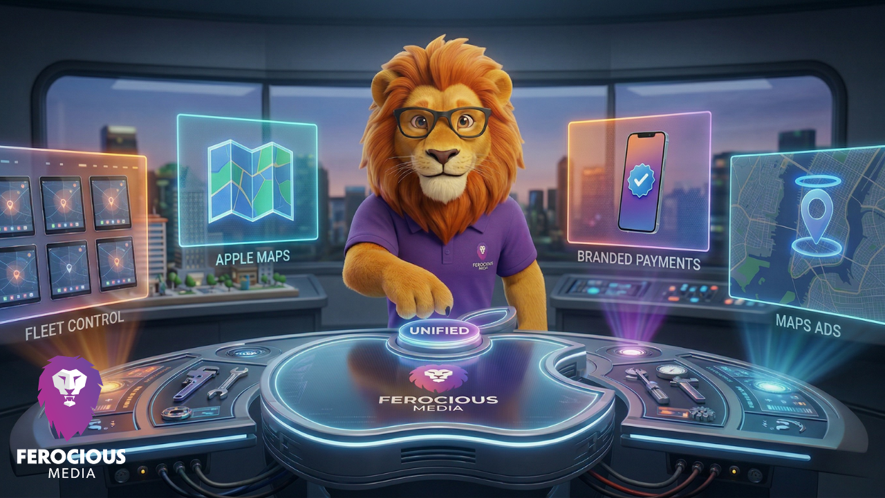
The Apple Business Revolution: What Plumbers and HVAC Pros Need to Know for April 14th

Is Google’s AI Overview Stealing Your Leads? The New SEO Rules for Home Service Contractors
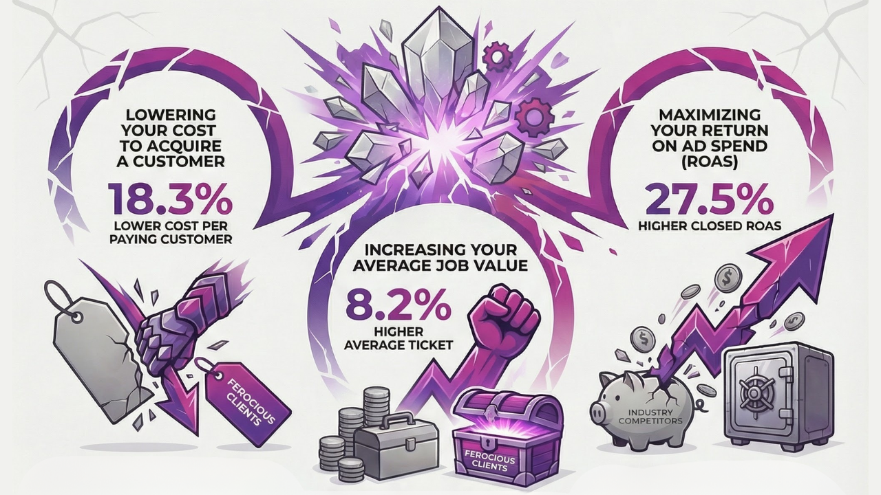
Unleashing Ferocious Results: Our Q4 2025 Advertising Performance

Twenty Years of Ferocious Media: A Founder Q&A on Staying Relevant, Efficient, and Accountable
Does Blogging Still Matter for SEO in the Age of AI?

GBP Radius Tightening: Why “Near Me” is Volatile Going Into 2026
The Real Way to Measure Home Services SEO Success (Beyond Rankings)
Ready for success?
Take the first step toward accelerating your business growth today!

